Last week the Fodor's New York City guide app for Windows phone launched. It's the first project I've completed working within the Metro design language and the first project I've done for a Windows device. You can download it from the Windows Marketplace.
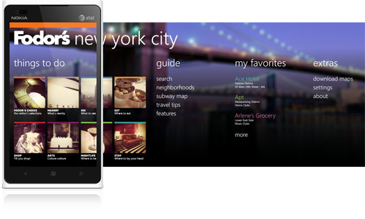
While the UI and UX systems place a number of constraints on the design, it was fun exploring a new paradigm and learning to design within its imposed structure. Working with Random House Digital and migration mobi, we decided to differentiate the app by highlighting Fodor's color-coded categories. We pushed to change app bar colors as users swiped through the different category panes, correlating those colors with the text.
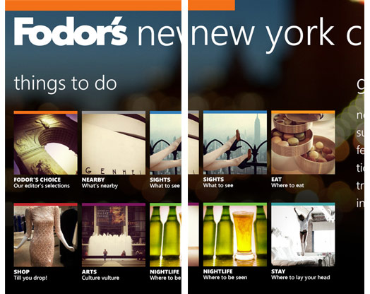
We also decided to lead with image tiles representing the different categories in order to create a highly visual entry point into the app, and also to help orient users once they've made their way around the carousel of choices on the hub page.
For the background image we had originally planned to use an image of the Brooklyn Bridge at dusk shot with coarse bokeh. The tiles gained focus as the seeming subject of a narrow depth of field shot. Unfortunately, we couldn't license the original photo, and so went with an alternate image of bridges spanning the East River. Astute observers will notice that some of the tiled images come from a certain someone's Instagram feed.
More screens after the jump.
I like your designs they are very interesting, unique.